14.5. Regression Assumption Examples#
Further Reading: §7.4 in Navidi (2015), Checking Assumptions and Transforming Data
14.5.1. Learning Objectives#
After studying this notebook and your lecture notes, you should be able to:
Check linear regression error assumptions using residual analysis (plots)
Recognize data that violate the linear regression error assumptions and understand next steps
import numpy as np
import math
import matplotlib.pyplot as plt
14.5.2. Assumptions#
Recall the following assumptions for linear regression error:
The errors \(\epsilon_1\), …, \(\epsilon_n\) are random and independent. Thus the magnitude of any error \(\epsilon_i\) does not impact the magnitude of error \(\epsilon_{i+1}\).
The errors \(\epsilon_1\), …, \(\epsilon_n\) all have mean zero.
The errors \(\epsilon_1\), …, \(\epsilon_n\) all have the same variance, denoted \(\sigma^2\).
The errors \(\epsilon_1\), …, \(\epsilon_n\) are normally distributed.
Below, we will look at a few examples of data that violate these assumptions and discuss what to do in those cases.
14.5.3. Example 1#
Following Example 7.20 in Navidi
Below is a plot of atmospheric ozone concentrations versus \(NO_x\) concentrations measured on 359 days in a recent year near Riverside, California. This is a heteroscedastic plot, meaning the vertical spread varies greatly with the fitted value (i.e. residuals).
These two plots were generated by pieceing together segments of normally distributed data around a line created with a lambda function (indicated in green, the best fit line) to demonstrate the trend.
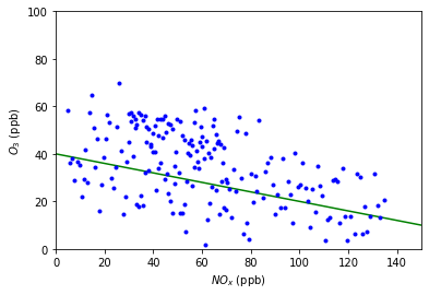
Above is a plot of ozone concentration versus \(NO_x\) concentration. The least squares line is sumperimposed.
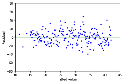
Above is a plot of residuals (\(\varepsilon _i\)) versus fitted values (\(\hat{\gamma _i}\)) for these data.
In this example, notice how the vertical spread increases with the fitted value. This indicates that the assumption of constant error variance (assumption #3) is violated, therefore we should not use the linear model in this case.
14.5.4. Example 2#
Following Example 7.21 in Navidi
A weld’s physical properties are influenced by the weld material chemical composition. The Ogden-Jaffe number is one measure of the chemical composition which is a weighted sum of the percentages of carbon, oxygen, and nitrogen in the weld.
These two plots were generated by pieceing together segments of normally distributed data around a line created with a lambda function (indicated in green, the best fit line) to demonstrate the trend.
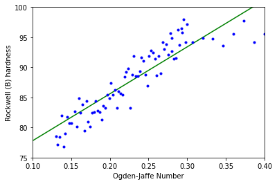
Above is a plot of Rockwell (B) hardness versus Ogden-Jaffe number. The least-squares line is superimposed.
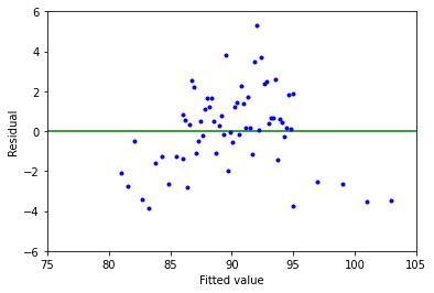
Above is a plot of residuals (\(\varepsilon _i\)) versus fitted values (\(\hat{\gamma _i}\)) for these data.
This example demonstrates a residual trend with the middle having positive residuals and the ends having negative residuals. This violates the assumption that the errors \(\varepsilon _i\) don’t all have a mean of 0, therefore we shouln’t use the linear model in this case.
This is typical when the relationship between variables is nonlinear or there are missing variables in the model.
14.5.5. Example 3#
Following Example 7.22 in Navidi
For a group of 255 gas wells, the monthly production per foot depth of the well is plotted against the fracture fluid pumped into it. This plot is also heteroscedastic.
These two plots were generated by pieceing together segments of normally distributed data around a line created with a lambda function (indicated in green, the best fit line) to demonstrate the trend.
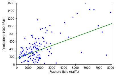
Above is a plot of mothly production volume of fracture fluid for 255 gas wells. The least-squares line is superimposed.
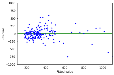
Above is a plot of residuals (\(\varepsilon _i\)) versus fitted values (\(\hat{\gamma _i}\)) for these data.
As with Example 1, we see that the vertical spread increases with fitted value, so this is another violation of the constant error variance assumption (#3). Again, a linear model would not properly represent these data.