1.15. Preparing Publication Quality Figures in Python#
1.15.1. Learning Objectives#
After studying this notebook, completing the activities, and asking questions in class, you should be able to:
Recognize features that make a scientific figure worthy of publication.
Understand how to add various features to scientific figures and be familiar with where to find syntax for reference.
1.15.2. What makes a scientific figure look great?#
Graphical Excellence
The following short article describes what makes a great scientific data visualization:
P. Kamat, G. V. Hartland, and G. C. Schatz (2014). Graphical Excellence, J. Phys. Chem. Lett., 5(12), 2118–2120.
Python Format Recommandations
Based on this paper, we developed the following guidelines to use with matplotlib.
Figure
Figure size: 4x4, 4x6.4
Dpi: 300
Plot
Line width: 3
Marker size: 8
Axes
Ticks font size: 15
Major ticks direction: in
Minor ticks direction: in
Axis Label
Font size: 16
Font weight: bold
All of these examples (below) use these guidelines.
1.15.3. Example: Data and Model Predictions#
In this first example prepared by Xinhong Liu, we will create a plot in the graphical abstract from:
J. A. Ouimet, X. L., D. J. Brown, E. A. Eugene, T. Popps, Z. W. Muetzel, A. W. Dowling, W. A. Phillip (2022). DATA: Diafiltration Apparatus for high-Throughput Analysis, J. Membrane Science, 641(1), p. 119743.
import numpy as np
import matplotlib.pyplot as plt
from matplotlib.lines import Line2D
For simplicity, we “hard coded” the data into this notebook. In our actually research code, these data are generated automaically, stored in csv files, and read into Python with pandas.
# Experiment data stored in dict
data_stru = {'time': [0, 10, 630, 715, 1445, 1480, 1930, 2395, 2430, 3330, 3540, 3665, 4530, 4875, 5360, 6280, 6415, 7085, 7940, 8240, 9030, 9930, 10235, 10930, 11680, 12280, 12575, 13230, 15215],
             'cF_exp': [15.20517956, 15.20517956, 20.17925714, np.nan, np.nan, 27.74228235, 31.0364, np.nan, 34.73451321, 42.10616744, np.nan, 41.21821818, 49.70306667, np.nan, 53.94549091, 55.5364, np.nan, 59.79315676, 63.0364, np.nan, 66.67276364, 68.6614, np.nan, 70.77833548, 74.22284068, 75.4501931, np.nan, 76.72061053, np.nan],
             'cV_avg': [np.nan, np.nan, np.nan, 2.371375951, 2.971221924, np.nan, np.nan, 3.608081644, np.nan, np.nan, 4.863598959, np.nan, np.nan, 6.184805962, np.nan, np.nan, 7.398282511, np.nan, np.nan, 8.986931928, np.nan, np.nan, 11.26145154, np.nan, np.nan, np.nan, 12.20494634, np.nan, 16.70175135]}

# Model predictions stored in dict
fit_stru = {'time': [0, 10, 630, 715, 1445, 1480, 1930, 2395, 2430, 3330, 3540, 3665, 4530, 4875, 5360, 6280, 6415, 7085, 7940, 8240, 9030, 9930, 10235, 10930, 11680, 12280, 12575, 13230, 15215],
            'cF': [15.20517956, 15.30581000885246, 21.186911048158944, 21.94776258720176, 27.935712649713867, 27.935712649713867, 31.41957200691469, 34.79231254607359, 34.79231254607359, 40.737212176615486, 42.024440019753044, 42.62511080503662, 47.51297790337563, 49.32034465832626, 51.47034529371476, 55.72406395078971, 56.31185664451917, 59.00364601757129, 62.300546660870005, 63.39102918275215, 65.91456478110173, 68.79648688113936, 69.72116826647738, 71.66837157084154, 73.72202692048653, 75.27787416192324, 76.01654487095536, 77.42158102079782, 81.81060107249392],
            'cH': [1.8971007608000001, 1.857468593269977, 1.7651071567700096, 1.844767802680894, 2.5666499819216466, 2.5666499819216466, 3.045470174932628, 3.5529667541583545, 3.5529667541583545, 4.568847236522133, 4.811750292853133, 4.92814180996477, 5.952827220990674, 6.369556241211926, 6.894439305225153, 8.034207387259743, 8.203010953189972, 9.013552663552899, 10.094858239741818, 10.475147439508877, 11.40039115341059, 12.537180598977393, 12.920607805042627, 13.758398327314904, 14.687274225493889, 15.422320387044207, 15.780811354585317, 16.479645784135432, 18.805287502530643]}
We define a function to create the plot. The optional arguements are toggles to turn certain aspects of the figure on or off. Sometimes, we add extra information to the figure (e.g., title with timestamp of experiment ID) that is useful when organizing results. But for a final publication, we want to remove that aspect of the figure. These toggles make sure customization easy (and clean).
plot_sim_comparison(data_stru,fit_stru,plot_pred=True,lg=True)
C:\Users\ebrea\anaconda3\envs\jbook\lib\site-packages\numpy\core\_methods.py:44: RuntimeWarning: invalid value encountered in reduce
  return umr_minimum(a, axis, None, out, keepdims, initial, where)
C:\Users\ebrea\anaconda3\envs\jbook\lib\site-packages\numpy\core\_methods.py:40: RuntimeWarning: invalid value encountered in reduce
  return umr_maximum(a, axis, None, out, keepdims, initial, where)
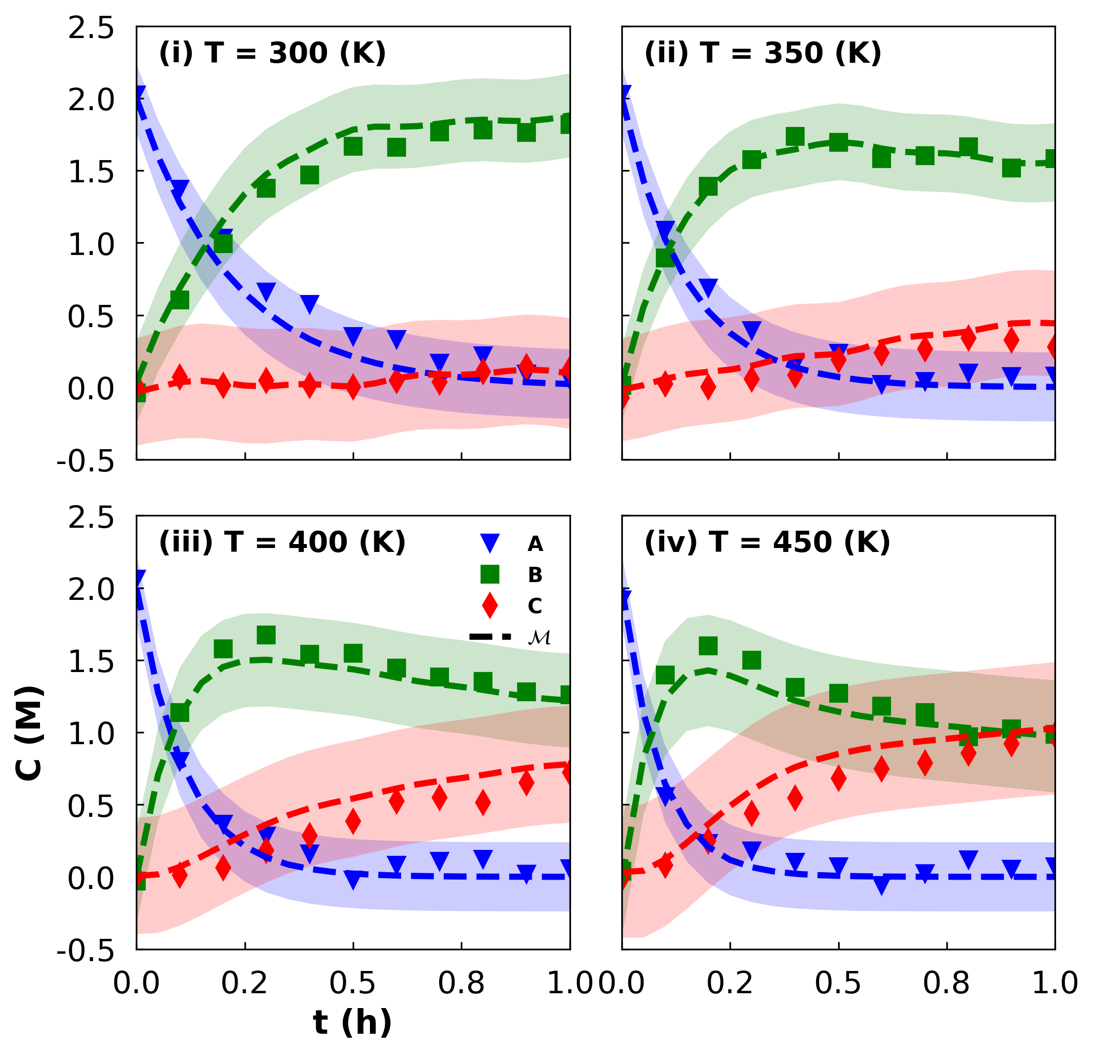
1.15.4. Example: Predictions with Uncertainty Bands#
In this next example, prepared by Kyla Jones, we will plot (synthetic) observed data, model predictions, and prediction uncertainty bands.
import numpy as np
import matplotlib.pyplot as plt
from matplotlib.ticker import FormatStrFormatter
from matplotlib.patches import Patch
from matplotlib.lines import Line2D
For simplicity, we define all of the data in this notebook. In actuality, involved calculations we performed to obtain the model predictions and uncertainty estimates.
### Hardcode all data

## y observed

Nobs = 11
Ntemp = 4

empty_obs = np.zeros([Ntemp, Nobs])

# species A
y_a = empty_obs.copy()
y_a[0] = np.array([2.02344425, 1.36860251, 1.03096299, 0.65740269, 0.57241884, 0.34985885, 0.33058912, 0.1681872,  0.21952612, 0.09226589, 0.04931872])
y_a[1] = np.array([2.02586019, 1.08716909, 0.68781963, 0.39403194, 0.16032257, 0.23428204, 0.02076534, 0.04033475, 0.0978981, 0.07540423, 0.07714833])
y_a[2] = np.array([2.06153694, 0.79796719, 0.36428256, 0.28103432, 0.15975079, -0.02254134, 0.07891708, 0.10685296, 0.12181174, 0.02014969, 0.05518219])
y_a[3] = np.array([1.91735135, 0.55511856, 0.23183268, 0.17951325, 0.10104957, 0.07111516, -0.06139098,  0.02229231,  0.11901155,  0.05373958,  0.06958662])

# species B
y_b = empty_obs.copy()
y_b[0] = np.array([-0.03752427, 0.60530102, 0.9955825, 1.37850256, 1.46935982, 1.66645002, 1.66070452, 1.76850223, 1.77915875, 1.76184489, 1.81672473])
y_b[1] = np.array([0.01296338, 0.89639214, 1.39186189, 1.57595299, 1.73540578, 1.69419998, 1.5826509,  1.60318491, 1.66460086, 1.51776157, 1.58146774])
y_b[2] = np.array([-0.02792897, 1.13569095, 1.57844183, 1.67418324, 1.5395483, 1.54537824, 1.44573124, 1.38463391, 1.35080703, 1.28076757, 1.25975991])
y_b[3] = np.array([0.0379667, 1.39594316, 1.59870984, 1.50034396, 1.31129013, 1.27005324, 1.18085389, 1.13550051, 0.96852283, 1.02524932, 0.98662983])

# species C
y_c = empty_obs
y_c[0] = np.array([0.01385988, 0.07233084, 0.0138011, 0.04580091, 0.01139069, 0.00281789, 0.04759571, 0.03531502, 0.10974563, 0.14194261, 0.12514075])
y_c[1] = np.array([-0.07376425, 0.0243219, 0.00364111, 0.05713541, 0.08313851, 0.18909311, 0.23693068, 0.26420506, 0.3413782, 0.32597304, 0.27979896])
y_c[2] = np.array([0.00943458, 0.01096848, 0.06149562, 0.18328175, 0.285206, 0.38444738, 0.52486223, 0.55009396, 0.51287361, 0.65236054, 0.72341975])
y_c[3] = np.array([-0.01221299, 0.07851271, 0.24902781, 0.44011205, 0.54449372, 0.68277854, 0.74685861, 0.78954617, 0.85525827, 0.92077101, 0.98371899])

## y predicted

Npred = 21

empty_pred = np.zeros([Ntemp, Npred])

# species A
y_a_star = empty_pred.copy()
y_a_star[0] = np.array([2, 1.59768464, 1.2762981, 1.01956093, 0.81446842, 0.65063184, 0.51975225, 0.41520009, 0.3316794, 0.26495954, 0.21166089,
                        0.16908368, 0.1350712, 0.10790059, 0.08619556, 0.06885666, 0.05500561, 0.04394081, 0.03510178, 0.02804079, 0.02240017])
y_a_star[1] = np.array([2, 1.43192894, 1.02521025, 0.73401411, 0.52552803, 0.3762594, 0.26938836, 0.1928725, 0.13808985, 0.09886743, 0.07078557,
                         0.05067995, 0.03628504, 0.0259788, 0.0185999, 0.01331687, 0.0095344, 0.00682629, 0.00488738, 0.00349919, 0.0025053])
y_a_star[2] = np.array([2.00000000e+00, 1.27514755e+00, 8.13000633e-01, 5.18347881e-01, 3.30485014e-01, 2.10708578e-01, 1.34342263e-01, 8.56531035e-02,
                        5.46101724e-02, 3.48180137e-02, 2.21990524e-02, 1.41535336e-02, 9.02392180e-03, 5.75341587e-03, 3.66822707e-03, 2.33876537e-03,
                        1.49113546e-03, 9.50708864e-04, 6.06147038e-04, 3.86463454e-04, 2.46398963e-04])
y_a_star[3] = np.array([2.00000000e+00, 1.13393738e+00, 6.42906988e-01, 3.64508132e-01, 2.06664698e-01, 1.17172413e-01, 6.64330892e-02, 3.76654815e-02,
                        2.13551486e-02, 1.21077006e-02, 6.86468715e-03, 3.89206267e-03, 2.20667767e-03, 1.25111715e-03, 7.09344247e-04, 4.02175978e-04,
                        2.28021187e-04, 1.29280873e-04, 7.32982072e-05, 4.15577884e-05, 2.35619648e-05])

# species B
y_b_star = empty_pred.copy()
y_b_star[0] = np.array([0.03270519, 0.39926139, 0.68731271, 0.9354765, 1.15467428, 1.33761972, 1.47392424, 1.56736103, 1.64477813, 1.72322029, 1.78283252,
                        1.80362121, 1.80259763, 1.80761942, 1.82500871, 1.84425379, 1.85162638, 1.84487036, 1.84124298, 1.85587223, 1.88118926])
y_b_star[1] = np.array([0.01671025, 0.55383436, 0.91650889, 1.17570006, 1.36693187, 1.5015587, 1.5820901, 1.62015396, 1.64645615, 1.67929046, 1.69878894,
                         1.68435974, 1.65219138, 1.629514, 1.62213033, 1.6187281, 1.60468673, 1.57720045, 1.55336206, 1.54843504, 1.55513168])
y_b_star[2] = np.array([-0.00610998, 0.70773819, 1.11833386, 1.3416306, 1.4524385, 1.49667326, 1.50216811, 1.48843442, 1.4704685, 1.45434913, 1.43575602,
                        1.40975002, 1.37968974, 1.3530836, 1.3326319, 1.31447336, 1.29341394, 1.2690736, 1.24668352, 1.23083234, 1.21997388])
y_b_star[3] = np.array([-0.03278059, 0.82392828, 1.23715807, 1.40009353, 1.42839638, 1.39244126, 1.33332529, 1.2726671,  1.21982743, 1.17694373,
                        1.14258333, 1.11470584, 1.0921472, 1.07408545, 1.05895914, 1.04463014, 1.02965292, 1.01413203, 0.99917604, 0.98542831, 0.97209606])

# species C
y_c_star = empty_pred
y_c_star[0] = np.array([-0.03270519, 0.00305397, 0.03638919, 0.04496257, 0.0308573, 0.01174844, 0.00632351, 0.01743888, 0.02354247, 0.01182017,
                        0.00550658, 0.02729511, 0.06233117, 0.08447999, 0.08879573, 0.08688955, 0.09336801, 0.11118882, 0.12365524, 0.11608698, 0.09641057])
y_c_star[1] = np.array([-0.01671025, 0.0142367, 0.05828086, 0.09028582, 0.10754011, 0.12218191, 0.14852154, 0.18697355, 0.21545399, 0.22184211, 0.2304255,
                        0.26496031, 0.31152357, 0.3445072, 0.35926977, 0.36795504, 0.38577887, 0.41597325, 0.44175055, 0.44806577, 0.44236302])
y_c_star[2] = np.array([0.00610998, 0.01711426, 0.0686655,  0.14002152, 0.21707649, 0.29261817, 0.36348962, 0.42591248, 0.47492132, 0.51083286, 0.54204493,
                        0.57609645, 0.61128634, 0.64116298, 0.66369988, 0.68318787, 0.70509493, 0.72997569, 0.75271033, 0.76878119, 0.77977973])
y_c_star[3] = np.array([0.03278059, 0.04213434, 0.11993494, 0.23539834, 0.36493892, 0.49038633, 0.60024162, 0.68966742, 0.75881742, 0.81094857,
                        0.85055198, 0.88140209, 0.90564613, 0.92466343, 0.94033152, 0.95496768, 0.97011906, 0.98573869, 1.00075066, 1.01453013, 1.02788038])

## variance of predictions

# species A
var_a = np.array([[0.05719945, 0.06328314, 0.07272865, 0.07949682, 0.08249553, 0.08242237, 0.08037767, 0.07733186, 0.07397983, 0.07075224, 0.06787686,
                   0.06544412, 0.06346087, 0.06188887, 0.0606701, 0.05974194, 0.05904548, 0.05852935, 0.0581509, 0.05787595, 0.0576778],
                  [0.05719945, 0.05976117, 0.06245206, 0.06325761, 0.06272024, 0.0616213, 0.06046344, 0.05947678, 0.05872418, 0.05818864, 0.05782545,
                    0.05758773, 0.05743631, 0.05734195, 0.05728416, 0.0572493, 0.05722852, 0.05721627, 0.05720911, 0.05720497, 0.05720258],
                  [0.05719945, 0.06055497, 0.06265554, 0.06218973, 0.06080576, 0.05949002, 0.05854026, 0.05794131, 0.05759333, 0.05740209, 0.05730114,
                    0.05724947, 0.05722364, 0.05721099, 0.05720489, 0.05720199, 0.05720062, 0.05719998, 0.05719969, 0.05719956, 0.0571995],
                  [0.05719945, 0.06748288, 0.07042203, 0.06676295, 0.06266473, 0.0599445, 0.05847011, 0.0577554, 0.05743287, 0.05729441, 0.05723713,
                   0.0572141, 0.05720505, 0.05720156, 0.05720023, 0.05719974, 0.05719955, 0.05719948, 0.05719946, 0.05719945, 0.05719945]])

# species B
var_b = np.array([[0.08041407, 0.08548342, 0.0942853, 0.10031488, 0.10237395, 0.10161885, 0.09899488, 0.09577745, 0.09238062, 0.08946731,
                   0.08694899, 0.08513801, 0.08373001, 0.08292177, 0.08236026, 0.08223461, 0.08220564, 0.08247615, 0.0827256, 0.0832465, 0.08456729],
                  [0.06996611, 0.07250687, 0.07466939, 0.07500611, 0.07410654, 0.07300714, 0.07191716, 0.07126404, 0.07080229, 0.07072385, 0.07069991,
                   0.07091747, 0.07107363, 0.07138765, 0.07158516, 0.07190796, 0.07210113, 0.07243694, 0.07272244, 0.07309388, 0.07318622],
                  [0.10459769, 0.10714292, 0.10847073, 0.10738268, 0.10580067, 0.10463459, 0.10399859, 0.10375836, 0.10374181, 0.10383653, 0.10396538,
                   0.10410001, 0.10421888, 0.10432586, 0.10441817, 0.10451517, 0.10463752, 0.10483768, 0.10511517, 0.10537128, 0.10597695],
                  [0.14939687, 0.15640947, 0.15673244, 0.15218987, 0.14859712, 0.14695313, 0.1465719, 0.14673995, 0.14705303, 0.14734157, 0.14755549,
                   0.1476938, 0.14777069, 0.1478045, 0.14781535, 0.14782897, 0.14787997, 0.14801416, 0.14831035, 0.1490566, 0.15126877]])

# species C
var_c = np.array([[0.13761351, 0.14268368, 0.151495, 0.1575553, 0.15967659, 0.15902096, 0.15653546, 0.15349447, 0.15030938, 0.14763968, 0.14539309,
                   0.14387839, 0.14278781, 0.14231509, 0.1421044, 0.14234241, 0.14268768, 0.14334096, 0.14397984, 0.14489511, 0.14661361],
                  [0.12716556, 0.12970804, 0.13188809, 0.13227501, 0.13146534, 0.13049419, 0.12956507, 0.12909831, 0.1288415,  0.12898045, 0.1291812,
                   0.12962646, 0.1300098,  0.13054754, 0.13096292, 0.13149577, 0.13188955, 0.13241524, 0.1328789, 0.13341603, 0.13366104],
                  [0.16179714, 0.16434671, 0.16571033, 0.16470349, 0.16323702, 0.16220358, 0.16170392, 0.16159574, 0.16170286, 0.16191099, 0.16214216,
                   0.16236761, 0.1625656, 0.16273996, 0.16288795, 0.1630292, 0.16318473, 0.16340753, 0.16369774, 0.16395741, 0.16455827],
                  [0.20659632, 0.21363847, 0.21416268, 0.20998773, 0.20681539, 0.2055619, 0.20550853, 0.20593768, 0.2064511,  0.20688658,  0.20720041,
                   0.20739674, 0.20749437, 0.20751608, 0.20748645, 0.20743568, 0.2074028, 0.20743782, 0.20762347, 0.20825134, 0.21034041]])

# set controls for predictions:
t_star = np.linspace(0,1.0,Npred) # range of times we wish to predict over

T_star = np.array([300.00,350.00,400.00,450.00]) # range of temperatures we wish to predict over

assert len(T_star) == Ntemp, "Dimension mismatch"

t = np.linspace(0,1.0,Nobs) # time-series used to generate ζ
Next, we create the four subplots.
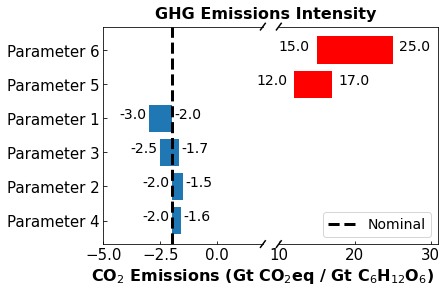
1.15.5. Example: Bar Charts for Sensitivity Analysis#
In this example, prepared by Maddie Watson, we plot results from a techneconomic sensitivity analysis. This plot is adapted from:
C. O’Brien, M. Watson, A. Dowling (2022). Challenges and Opportunities in Converting CO2 to Carbohydrates. under review code
import numpy as np
import matplotlib.pyplot as plt
import pandas as pd

# Organize Data into Pandas Dataframe

# Values are put into a pandas data frame so they can be sorted
# params is the parameter name of each bar
# values is the difference between the max and min of the parameter variation (bar width)
# start is the minimum point of the parameter variation and defines the starting value of each bar

df = pd.DataFrame(
    dict(
        params = ['Parameter 1','Parameter 2','Parameter 3','Parameter 4','Parameter 5','Parameter 6'],
        values = [1 ,0.5,0.8,0.4,5,10],
        start = [-3,-2,-2.5,-2,12,15]

    )
)

print(df)
        params  values  start
0  Parameter 1     1.0   -3.0
1  Parameter 2     0.5   -2.0
2  Parameter 3     0.8   -2.5
3  Parameter 4     0.4   -2.0
4  Parameter 5     5.0   12.0
5  Parameter 6    10.0   15.0
#Sort Data Frame

# The command below sorts the 'values' (barwidth) so they are displayed in the diagram as highest to lowest
# This ensures the tornado-like appearence
df_sorted = df.sort_values('values')

# re-index the dataframe to go 0-5 after sorting
df_sorted['index'] = np.arange(0,len(df['params']),1)
df_sorted.set_index('index',inplace=True)

print(df_sorted)
            params  values  start
index
0      Parameter 4     0.4   -2.0
1      Parameter 2     0.5   -2.0
2      Parameter 3     0.8   -2.5
3      Parameter 1     1.0   -3.0
4      Parameter 5     5.0   12.0
5      Parameter 6    10.0   15.0
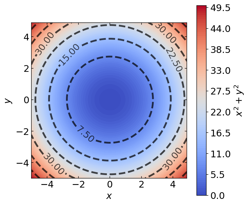
1.15.6. Example : Colored Contour Plots#
Finally, in this example prepared by Ke Wang, we prepare a colored contour plot.
import pandas as pd
import numpy as np

import matplotlib.pyplot as plt
from matplotlib import cm
%matplotlib inline
%config InlineBackend.figure_format='retina'
We plot the function
over the domain \(x \in [-5, 5]\) and \(y \in [-5, 5]\)
# enumerate samples
x = np.arange(-5, 5, 0.1)
y = np.arange(-5, 5, 0.1)
x, y = np.meshgrid(x, y)

# extract x-axis and y-axis size
m, n = x.shape
# define function for z
z = lambda x,y: x**2 + y**2